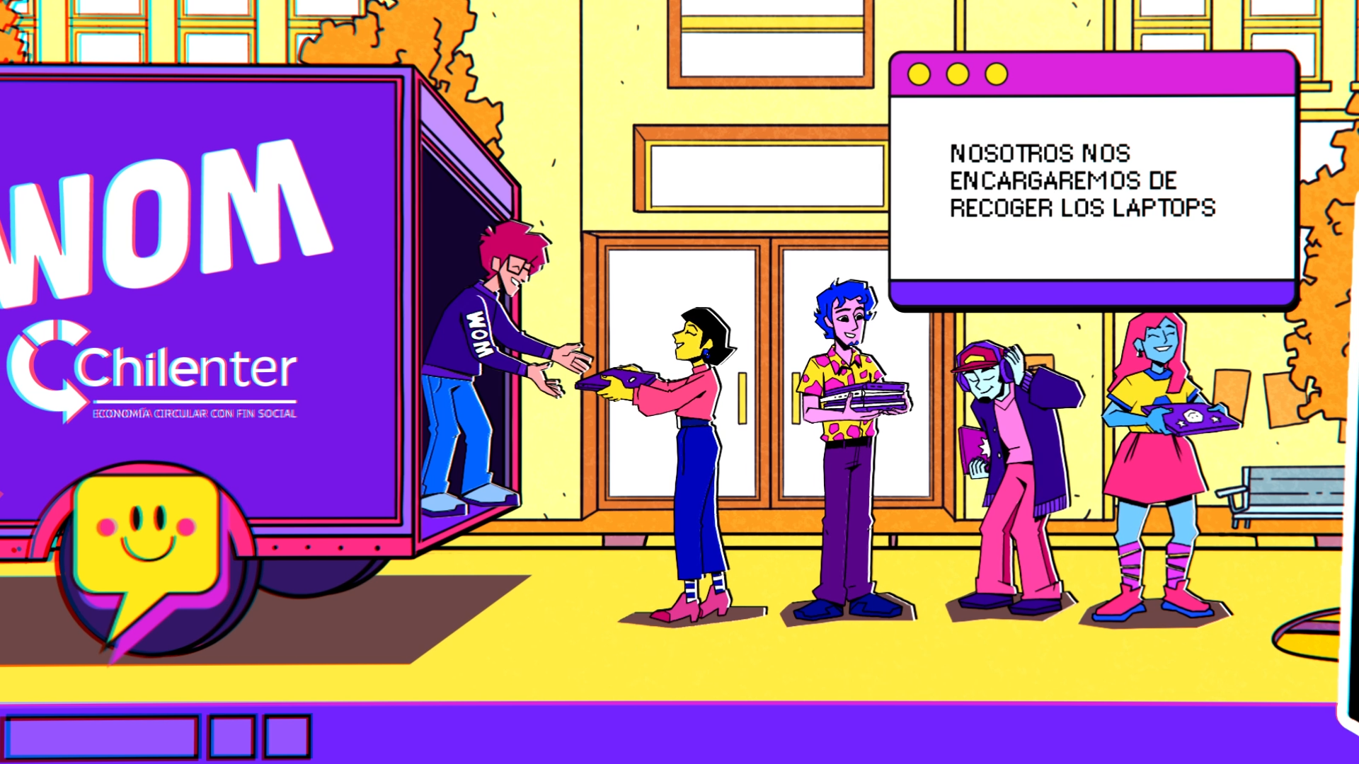
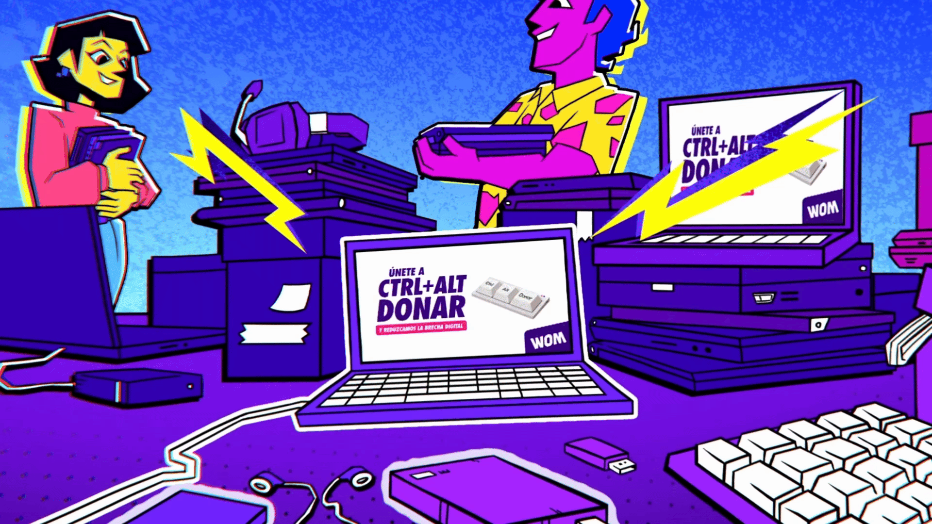
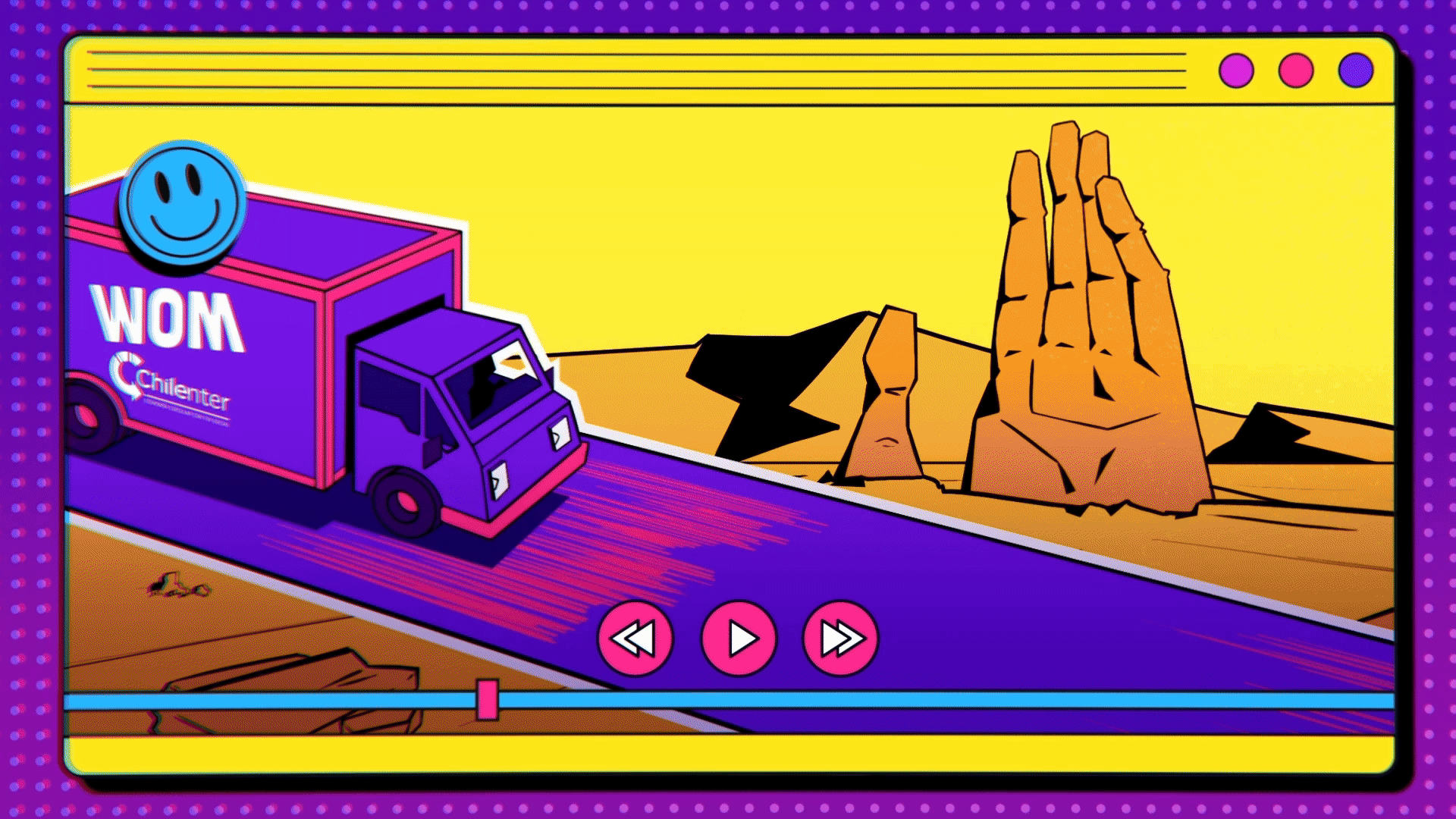
WOM is a Chilean telecommunications company that, with the support of other organizations, seeks to reduce the digital divide by donating computers to children across the country. Our role in this mission is to help bring this vision to life by developing an animated commercial that combines unique designs with technological elements.
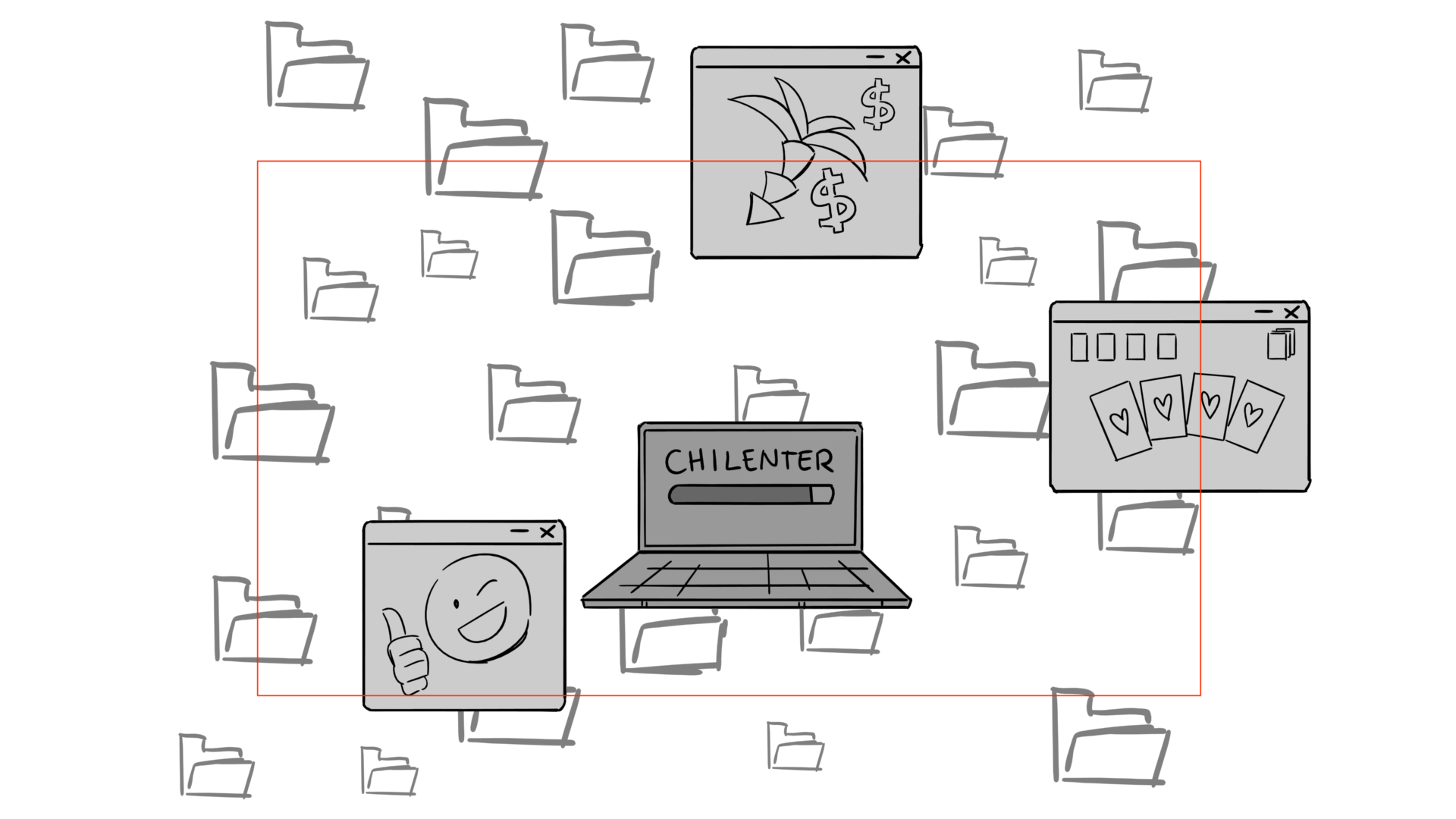
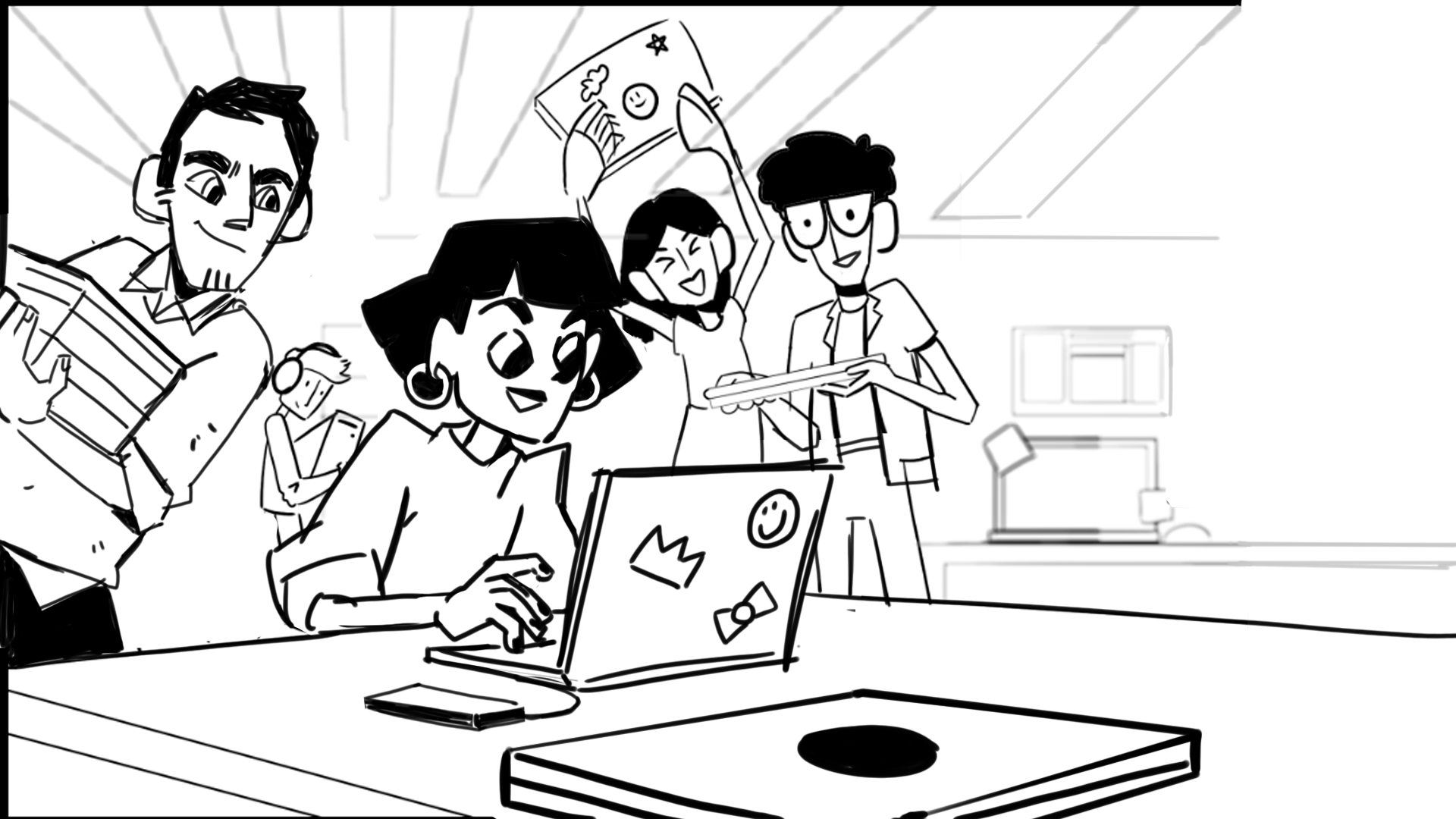
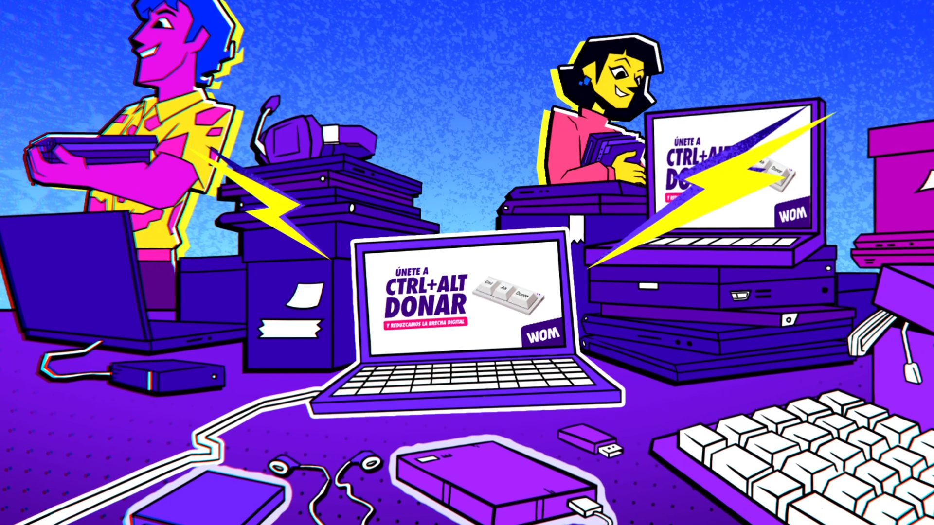
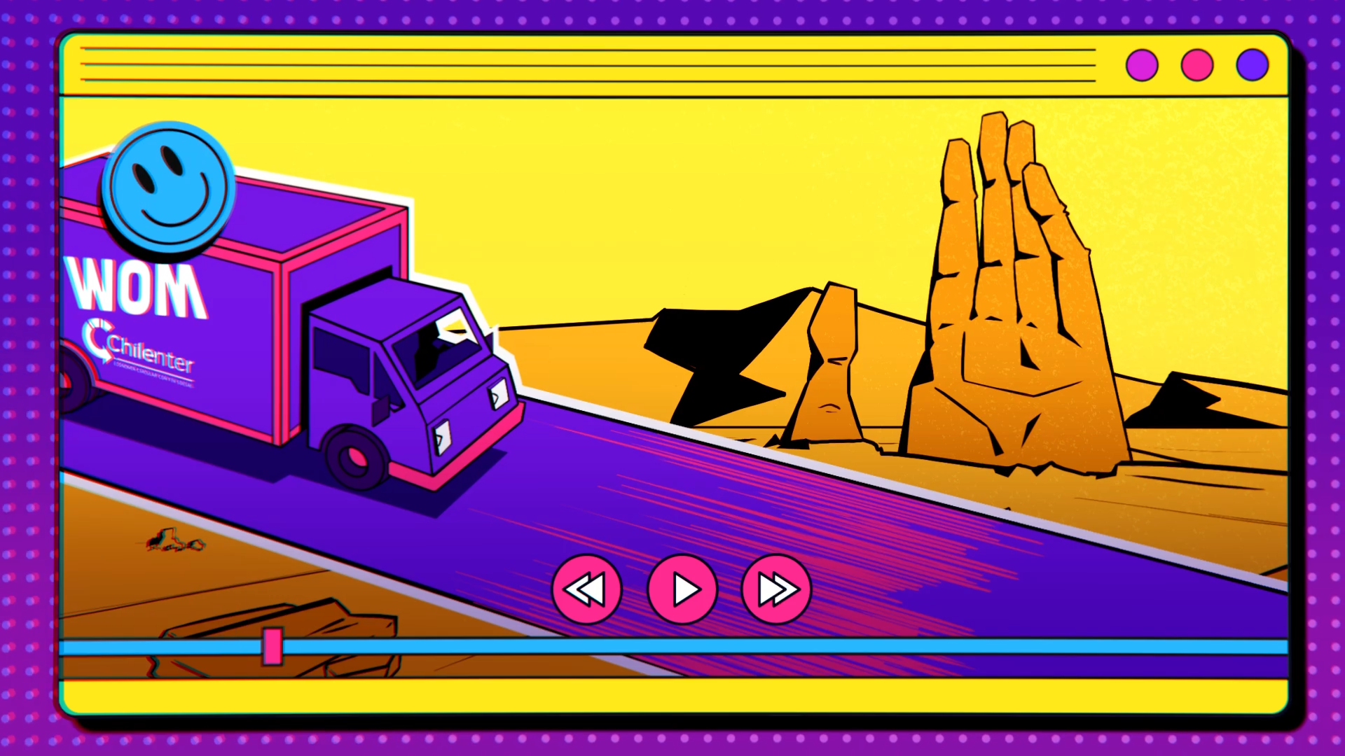
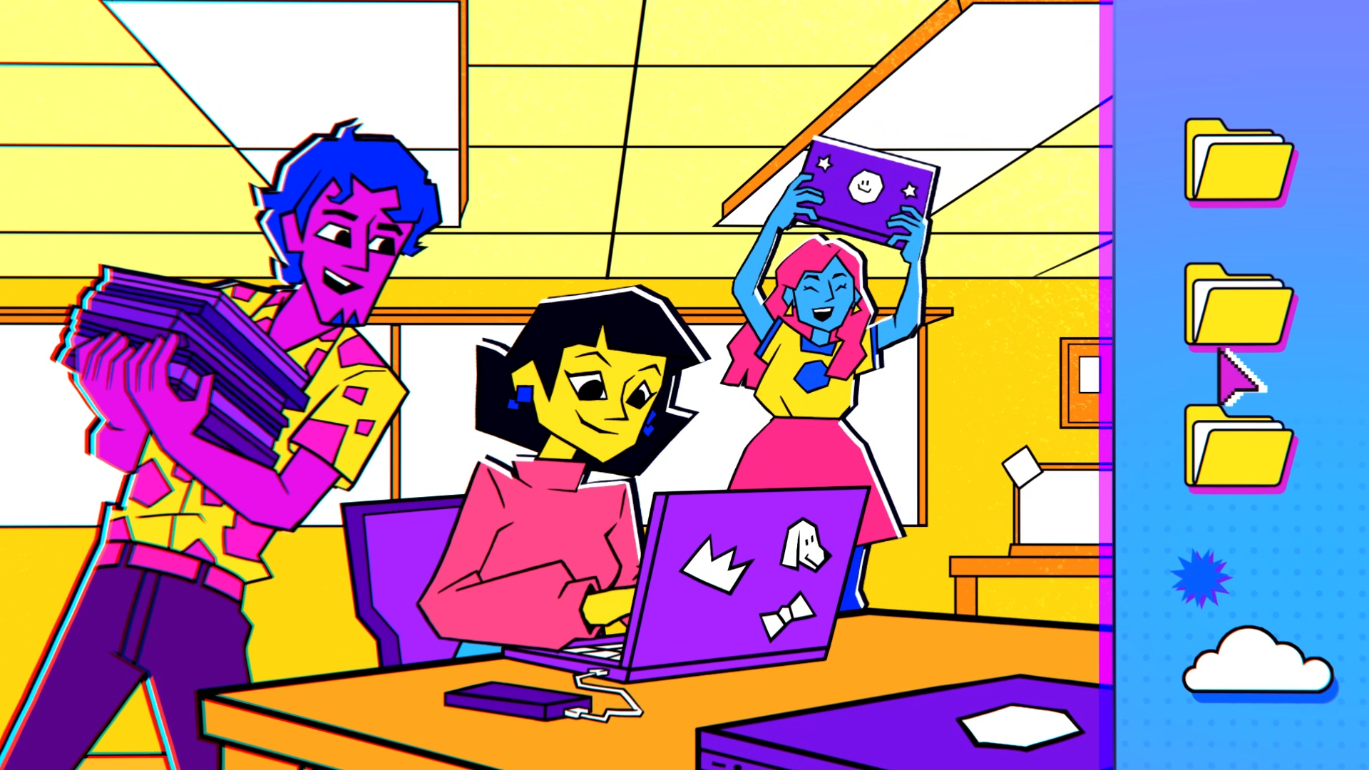
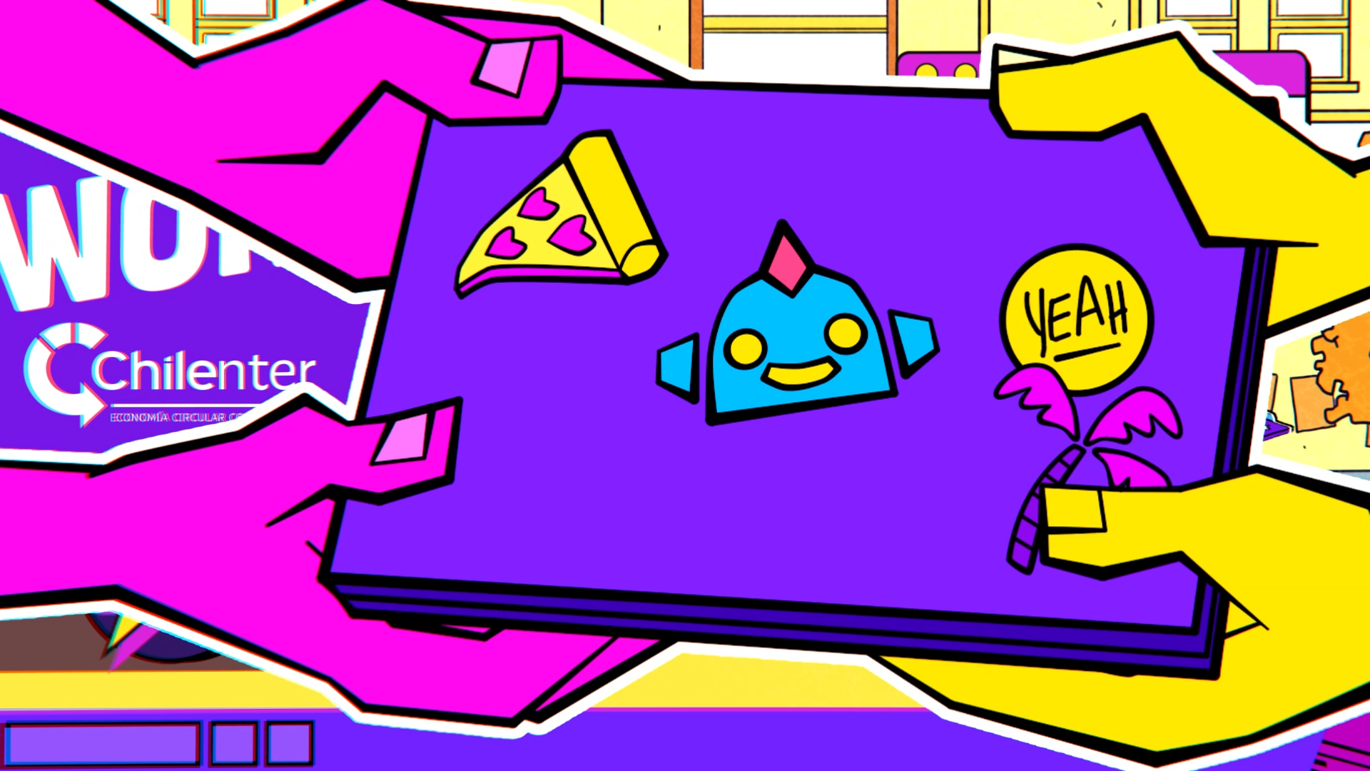
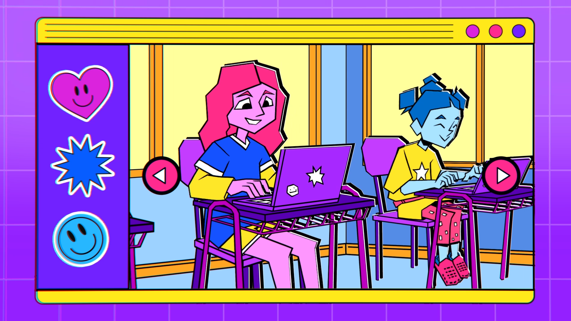
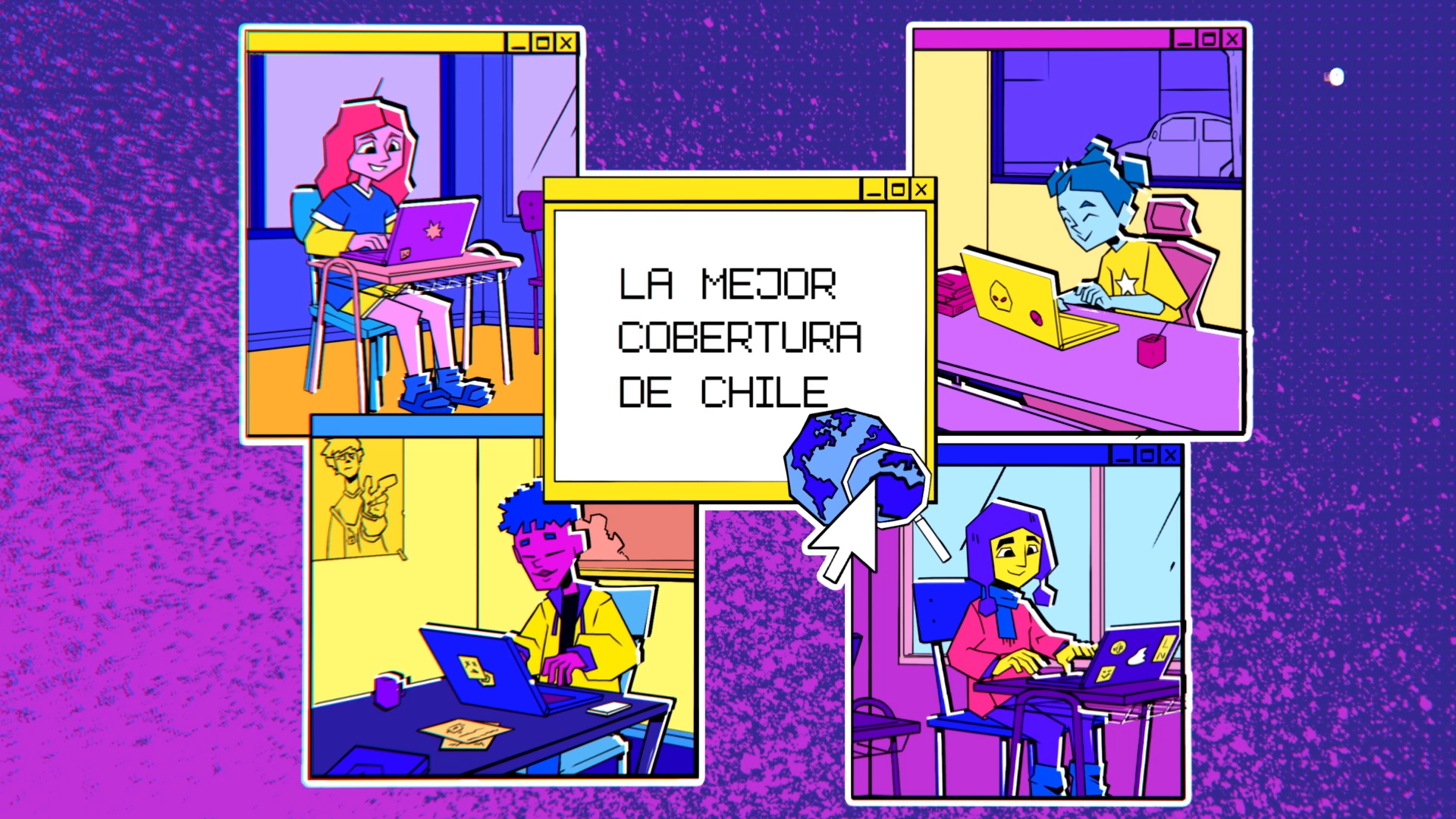
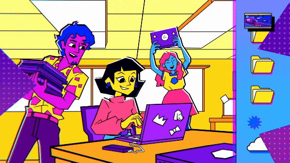
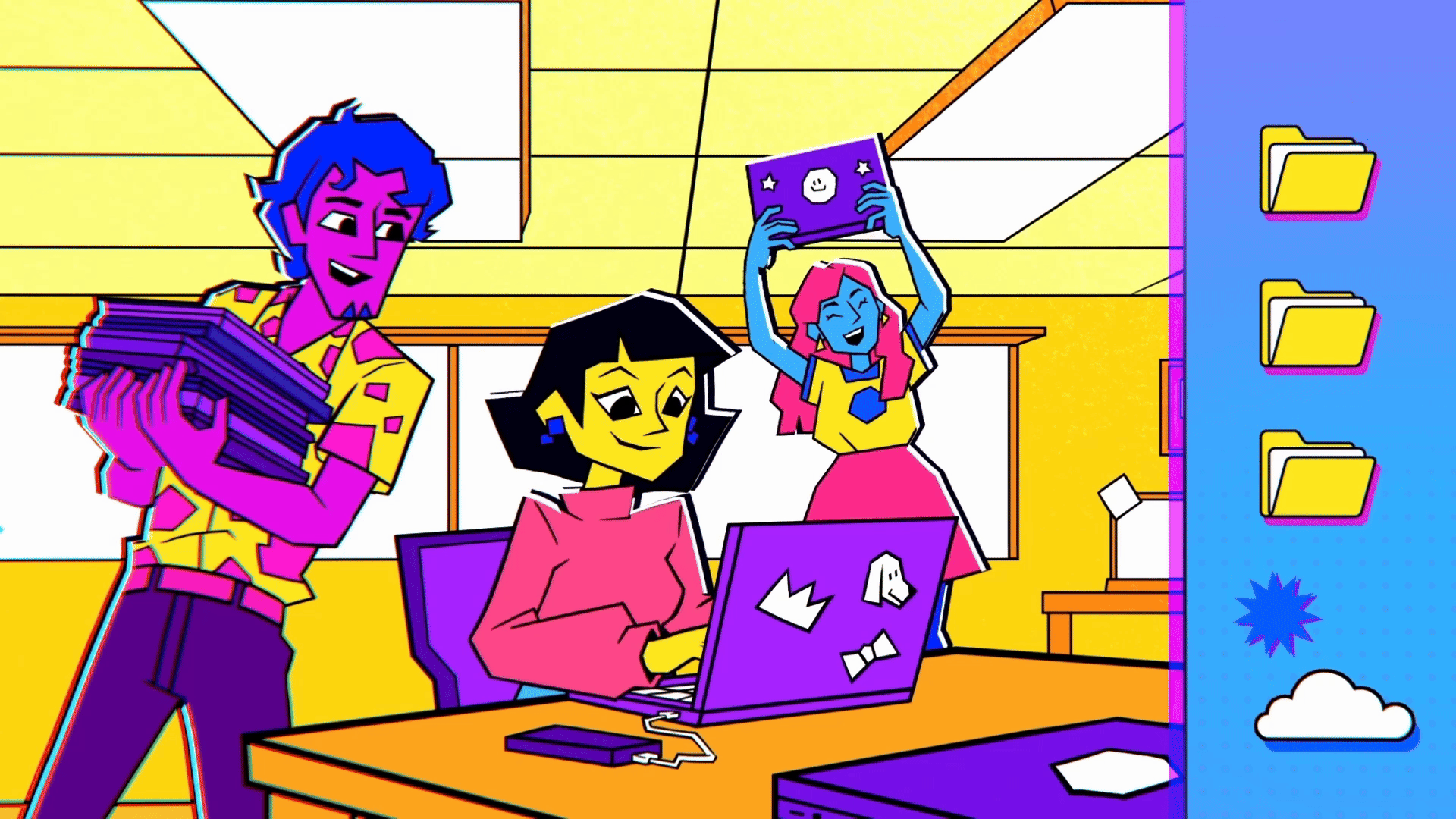
Throughout the commercial, computer-inspired graphics were integrated, such as cursor arrows, windows, pop-ups, and other interface elements. These visuals are seamlessly connected with iconic locations across Chile, including the emblematic Hand of Antofagasta, the colorful hills of Valparaíso, and the stilt houses of Chiloé. In addition, the characters feature a modern design style that ranges from children to adults, reflecting a diversity of identities and aligning with the fresh, contemporary vision that defines WOM.
This process was an exciting challenge, as it required adapting a two-dimensional style to live-action footage. To achieve this, we proposed distinctive brand-driven designs and colors, such as purple in its various shades, along with yellow and pink.
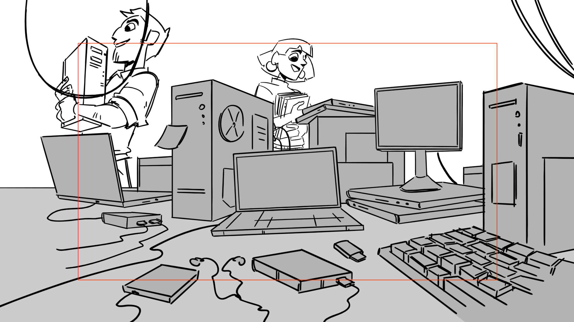
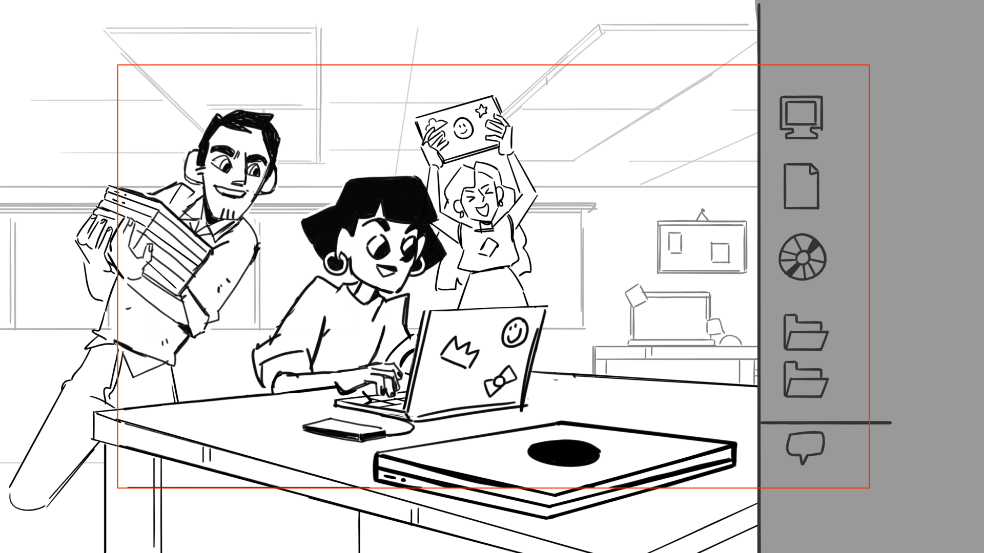
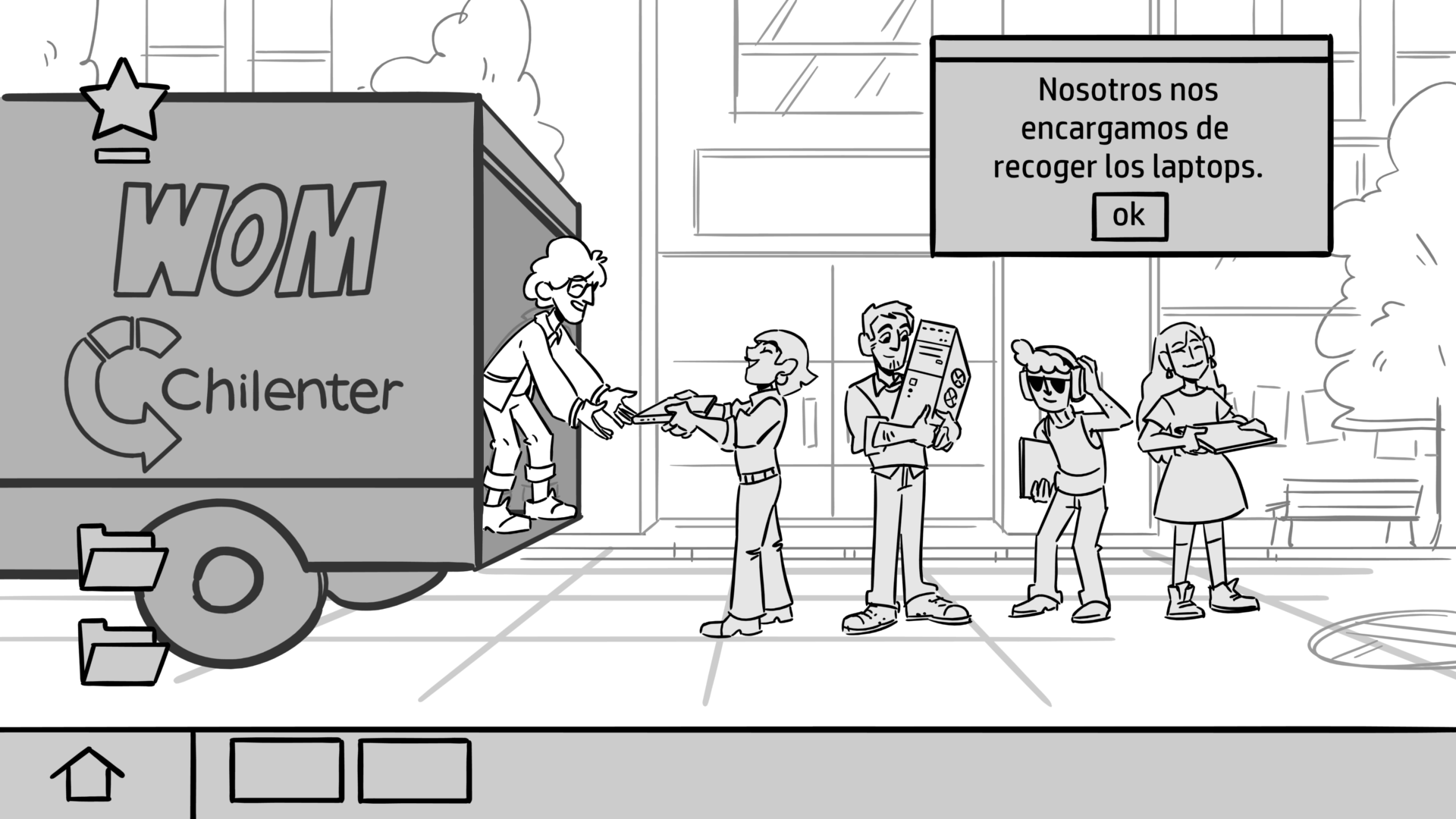
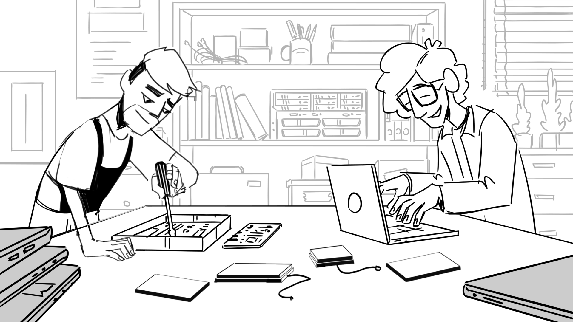
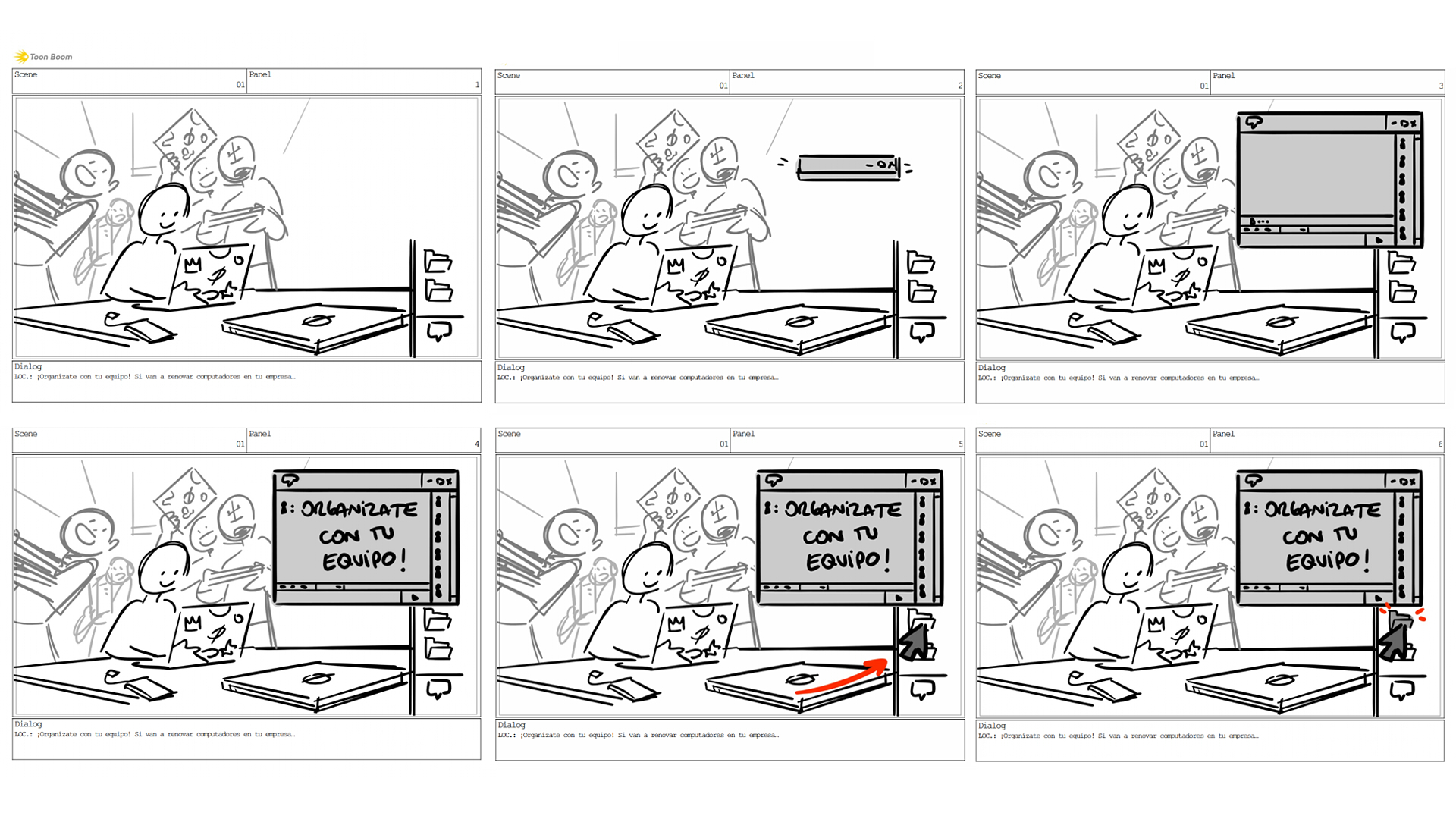
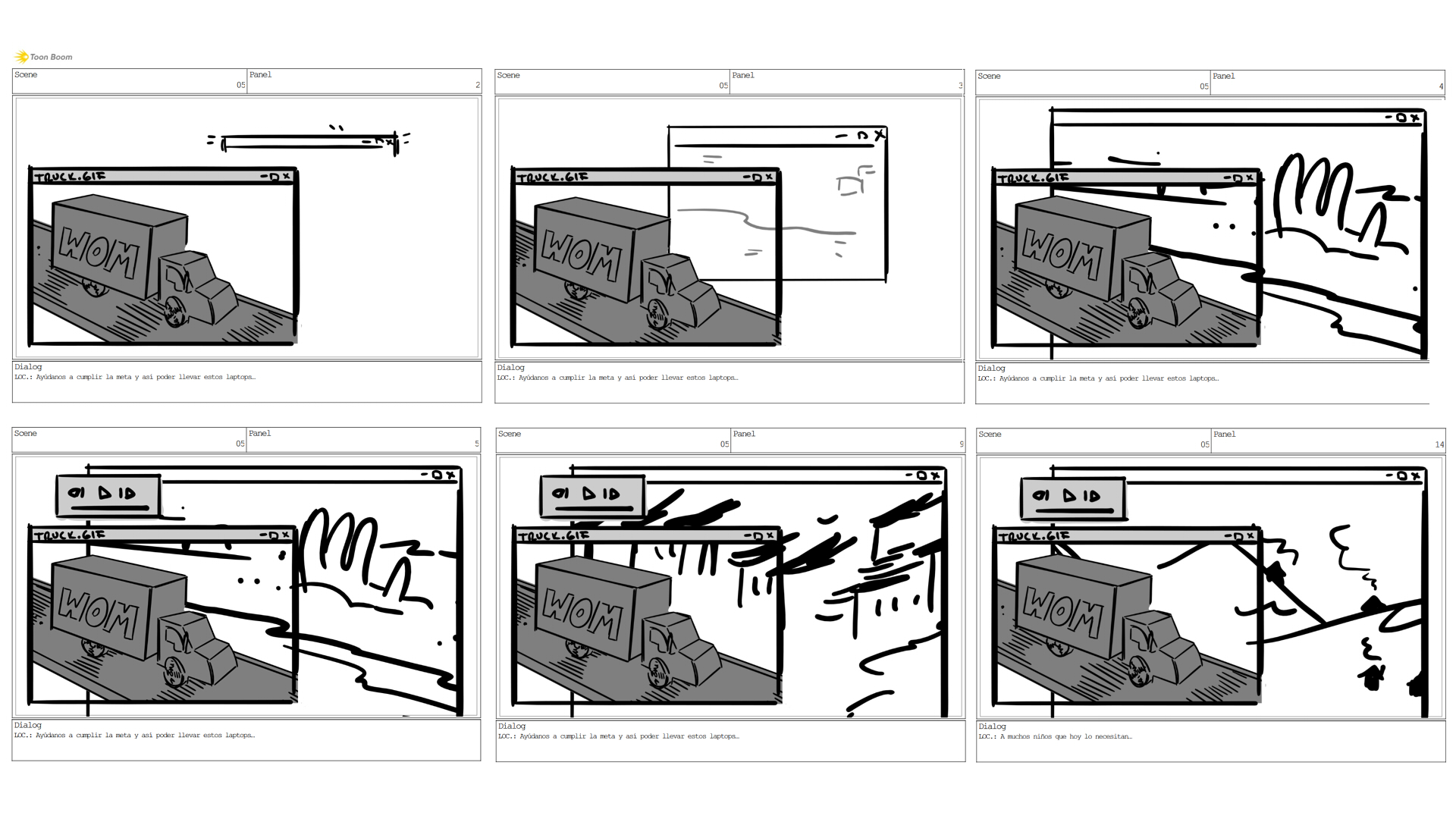
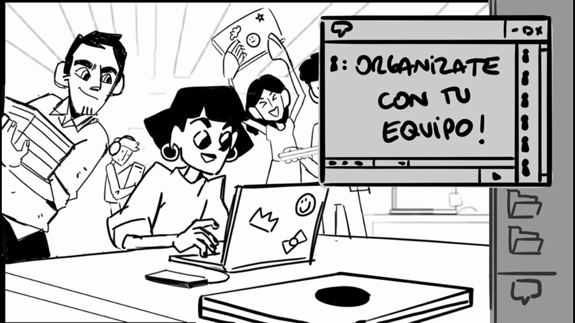
02 STORYBOARD
The editing was handled in a dynamic way, incorporating brand effects and various locations across the country to strengthen the client’s campaign. In addition, we added multiple digital overlays to convey a modern, technology-driven style.
03 STYLEFRAMES
By working with a limited color palette, it was essential for each shot’s color scheme to remain harmonious. For this reason, a primary color is emphasized in every shot, while the remaining elements are carefully adjusted in saturation, hue, and brightness to complement and enhance the visual composition in a balanced way.
04 PROCESS
As a starting point, the storyboard was used to detail the elements present in each shot. This material served as the basis for a thorough breakdown, identifying the number of characters, graphics, and elements required for each shot. With this information, a layered workflow was organized in MOHO, where the assets were designed and animated.
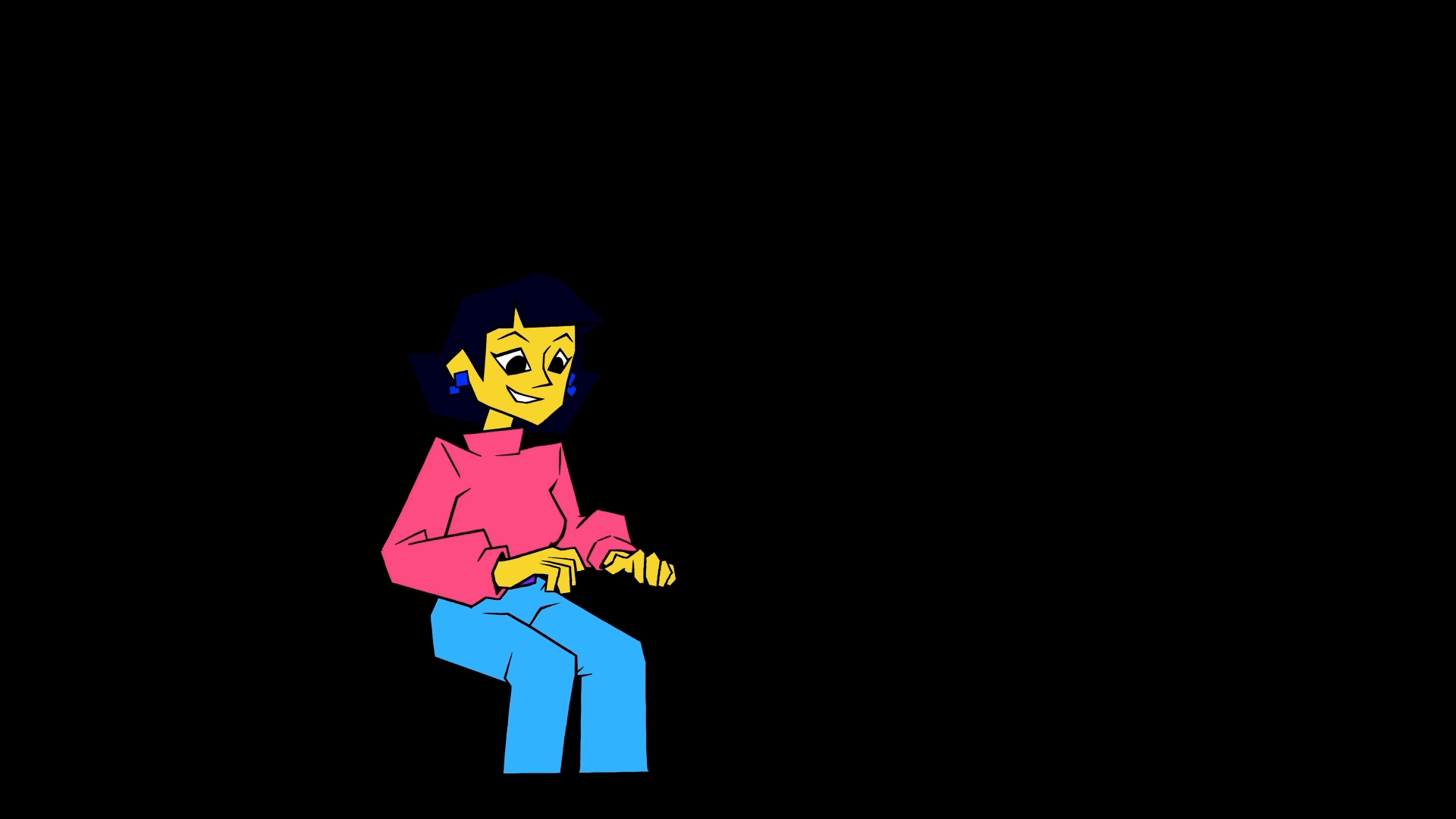
05 ANIMATION
In this section, we approached animation in a distinctive way by using limited animation techniques, where excessive fluidity is not the goal, yet the same results as conventional animation are achieved. This approach proved key to aligning with the client’s campaign, meeting both the requested theme and style.